| Title | Description | Long_description | Columns | Unique_parameters | Latest_release |
|---|---|---|---|---|---|
| Deaths registered weekly in England and Wales by age and sex... | Provisional counts of the number of deaths registered in Eng... | Quality and methodology information for mortality statistics... | ['v4_1', 'Data Marking', 'calendar-years', 'Time', 'administ... | {'v4_1': None, 'Data Marking': None, 'calendar-years': None,... | 2023-08-30T00:00:00.000Z |
| Annual GDP for England, Wales and the English regions... | Annual economic activity within England, Wales and the nine ... | Quality and Methodology Information (QMI) for quarterly regi... | ['v4_1', 'Data Marking', 'calendar-years', 'Time', 'nuts', '... | {'v4_1': None, 'Data Marking': None, 'calendar-years': None,... | 2023-05-18T00:00:00.000Z |
| Generational income: The effects of taxes and benefits... | The effects of direct and indirect taxation and benefits rec... | Analysis of how household incomes in the UK are affected by ... | ['v4_1', 'Data Marking', 'yyyy-to-yyyy-yy', 'Time', 'uk-only... | {'v4_1': None, 'Data Marking': None, 'yyyy-to-yyyy-yy': ['19... | 2022-09-15T00:00:00.000Z |
| Coronavirus and the latest indicators for the UK economy and... | These shipping indicators are based on counts of all vessels... | In this paper we present an initial exploration of the use o... | ['v4_1', 'Data Marking', 'calendar-years', 'Time', 'uk-only'... | {'v4_1': None, 'Data Marking': None, 'calendar-years': None,... | 2023-05-25T00:00:00.000Z |
| Earnings and Hours Worked, UK Region by Industry by Two-Digi... | Annual estimates of paid hours worked and earnings for UK em... | National Statistic What it measures Estimates of the struc... | ['V4_2', 'Data Marking', 'CV', 'calendar-years', 'Time', 'ad... | {'V4_2': None, 'Data Marking': ['x', nan], 'CV': ['x', '23.0... | 2023-01-13T00:00:00.000Z |
This post is by our intern Rowan, who has been a great addition to our team for the last six months. Rowan has focused on developing AI tools to enhance the daily research activities at Autonomy.
Check out the code on GitHub
Interactive demo
Intro
The process of discovering datasets through manual Google searches and individual downloads presents a significant challenge. This approach often results in datasets being sourced individually, leading to difficulties regarding cross-comparison of data . As a result, the endeavour of finding relevant datasets and conducting meaningful comparisons becomes both arduous and time-consuming. Of course, even through such searches, there remains the possibility that some datasets simply haven’t been unearthed and thus remain unknown to the researcher.
To address this issue, I’ve been automating the gathering of datasets from key sources via APIs and web scraping, and creating a single metadata dataset - what we’ve been calling the ‘database of databases’. This dataset becomes the core of a sort of recommendation system: within this system, finding datasets with relevant content or resembling ones already in the metadata collection becomes much easier. This approach is all about making dataset discovery faster and more effective, using clear visualisations and organised management.
This blog walks through the process of achieving this.
Data Collection
Autonomy is a research organisation that focuses on the future of work and economic planning, and therefore the vast majority of the datasets come from the ONS (Office for National Statistics). The ONS is the UK’s largest independent producer of official statistics with data relating to the economy, population, and society at various levels. This data is collected either through their API or the Nomis API. As well as the ONS, the Monthly Insolvency Statistics, NHS Quality and Outcomes Framework, and police data are also included. These datasets provide insights into bankruptcy trends, healthcare data used to assess the NHS services, and crime statistics.
The metadata being collected for each dataset includes the title, a short description, a long description, the column titles, unique non-numeric column values / parameters, and the release date / date the dataset was last updated. This combination of data should provide a solid overview of the dataset and enough information to make decisions on their similarity with other datasets.
| Title | Description | Long_description | Columns | Unique_parameters | Latest_release |
|---|---|---|---|---|---|
Comparing Datasets
Utilising the gathered metadata, several methods emerge for dataset comparison. The first and most straightforward approach involves column matching. When two or more columns align, datasets can be merged, creating one larger combined dataset. However, a challenge arises due to the variability in column names, including differences in terminology, abbreviations, and spelling. This can result in missing out on potentially valuable column matches. To address this, we not only consider exact matches but also explore similar column names using fuzzy string matching, which helps us find comparable columns.
However, even with these methods, some situations remain unaccounted for. Some datasets might share similarities or relevant information without having any common columns. For such cases, a more inventive approach comes into play. We can use embeddings to compare dataset descriptions, in-depth explanations, and titles. This method enables us to uncover connections that might not be immediately apparent.
Columns
Identical
Discovering identical columns between datasets follows a straightforward process. I started by retrieving the column list from our chosen dataset. For each other dataset it is to be compared with, I compiled a list of column names that are shared. The length of this shared column list serves as an indicator of the degree of similarity between the two datasets. However, even the presence of a single shared column holds value.
Going one step further, I wanted to favour rare connections, meaning I wanted to find datasets, linked by certain columns, that are more challenging, or less intuitive, to find connections between. To achieve this, I can count the occurrences of each distinct column across all datasets, which gives us a sense of how common columns are. By calculating the reciprocal of this count, I create a measure of rarity. Instead of simply adding up shared column counts to assess similarity, I can sum up the weights assigned to these shared columns. This approach allows me to emphasise the significance of less common connections.
The following is an example of how one calculates the rarity of connections given two lists of columns shared between one dataset A and two other datasets B and C.
\[
\begin{aligned}
\begin{array}{l}
\end{array}
\end{aligned} \\
\begin{array}{l}
\text{Shared columns} \\
\begin{pmatrix}
Age \\
Gender \\
Geography
\end{pmatrix} \\
\begin{pmatrix}
Gender \\
Cars (per 1000) \\
Population
\end{pmatrix}
\end{array}
\begin{array}{l}
\longrightarrow \\ \\ \\
\longrightarrow
\end{array}
\begin{array}{l}
\text{Weights} \\
\begin{pmatrix}
5 \\
8 \\
10
\end{pmatrix} \\
\begin{pmatrix}
8 \\
1 \\
4
\end{pmatrix}
\end{array}
\begin{array}{l}
\xrightarrow{reciprocals} \\ \\ \\
\xrightarrow{reciprocals}
\end{array}
\begin{array}{l}
\text{Updated weights} \\
\begin{pmatrix}
0.20 \\
0.13 \\
0.10
\end{pmatrix} \\
\begin{pmatrix}
0.13 \\
1.00 \\
0.25
\end{pmatrix}
\end{array}
\begin{array}{l}
\xrightarrow{sum} \\ \\ \\
\xrightarrow{sum}
\end{array}
\begin{array}{l}
\text{\quad 0.43} \\ \\ \\
\text{\quad 1.38}
\end{array}
\]
We can clearly see that the columns shared between datasets A and C are less common than those shared by A and B and that is reflected in final weight given.
Similar
Linking similar columns requires natural language processing (NLP), specifically fuzzy string matching. The goal of fuzzy string matching is to determine a level of similarity or distance between two strings where they contain minor variations that make exact string matching challenging. There are various algorithms for doing this but the one I used was the Jaro-Winkler similarity. Jaro-Winkler works by considering matching characters within a certain range and giving extra importance to matching prefixes, producing a similarity score between 0 and 1.
For every pair of datasets I go through each of the columns and calculate the similarity score. Columns given a score above a threshold value are deemed to be close enough to be valuable and saved to a list. The length of this list of similar columns determine how correlated the two datasets are. In this case identical columns can be ignored as we don’t need to check if they are similar.
\[ \text{Jaro-Winkler Distance: } d_j(s_1, s_2) \text{ where } s_1 \text{ and } s_2 \text{ are strings} \] \[ d_j(\text{Hello}, \text{Hlelo}) = 0.94 \textit{\quad(match)} \] \[ d_j(\text{Hello}, \text{Hey}) = 0.75 \textit{\quad(no match)} \]
However, even with these methods, some situations remain unaccounted for. Some datasets might share similarities or relevant information without having any common columns. For such cases, a more inventive approach comes into play. We can use embeddings to compare dataset descriptions, in-depth explanations, and titles. This method enables us to uncover connections that might not be immediately apparent.
Embeddings
Text embeddings refer to the process of converting text into a fixed-size numerical vector representation. These vectors capture the semantic meaning and contextual information of the text in a way that can be used for various natural language processing (NLP) tasks.
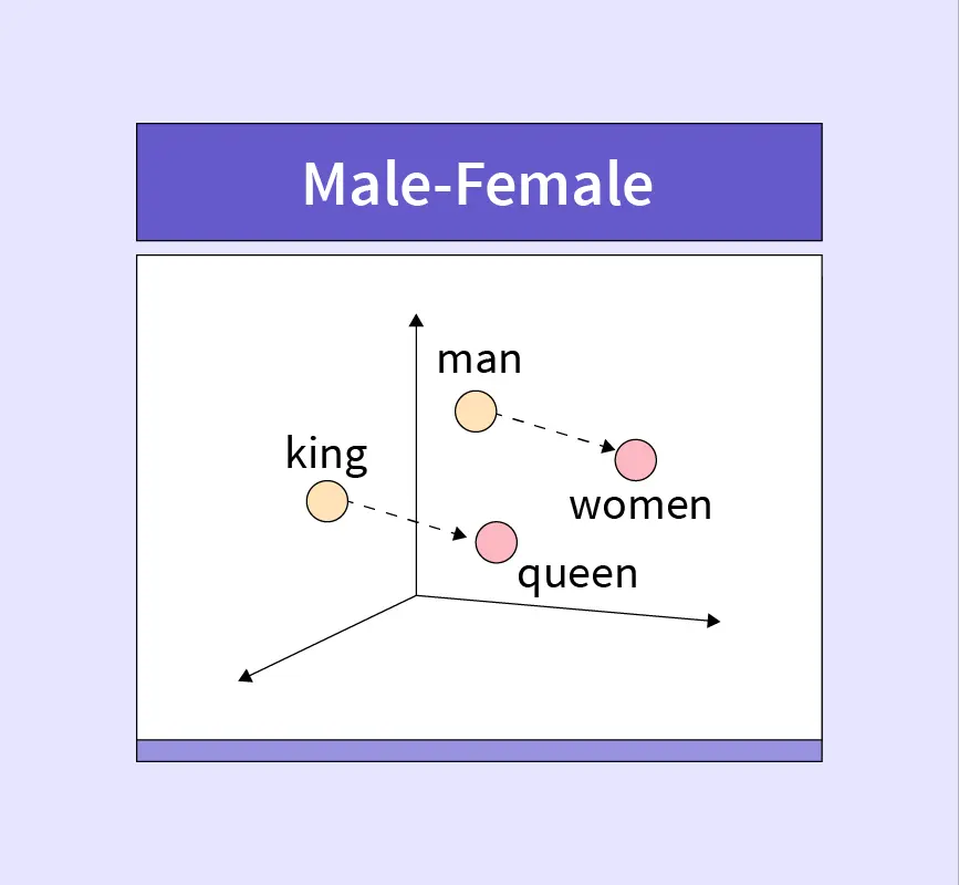
To understand this better let’s look at an example using word embeddings. Word embeddings capture the semantic relationships between words. Each word is mapped to a vector in a high-dimensional space. Words more closely related will sit closer to each other in this vector space.
Here we have four words, man, woman, king, queen. When each one is given an embedding vector and plotted we see that king and man are close and queen and woman are close due to their semantic meaning.
Sentence embeddings work in the same way although sentences are more complex than words as they can vary in length and structure. Sentence embeddings aim to capture the overall meaning of a sentence taking into account relationships between words and the context in which they appear.
The ability of embedding to encode semantic meaning and context makes it the ideal method to compare the dataset descriptions captured as part of the metadata.
I used OpenAI’s “text-embedding-ada-002” model via the API which returns a 1536 dimensional vector. The data used was a combination of the title, description, and long description for every dataset to generate embeddings and the output saved to a dataframe along with the relevant dataset title.
Similarity between embeddings
The dot product of two vectors can be used to calculate the distance between them. Since the distance between two embedding vectors tells us how similar two pieces of text are, the dot product is essentially a similarity rating. Alternatively, clustering algorithms can be used to group datasets together on their descriptions. This is an incredibly powerful search tool as this can all be done much faster than a person manually searching through datasets to find those that sound like they could be related.
The dot product of two vectors serves as a measure to compute the distance between them. Since the distance between two embedding vectors tells us how similar two pieces of text are, when applied to embedding vectors, the dot product essentially quantifies the similarity. Alternatively, employing clustering algorithms can group datasets based on their descriptions. This dynamic search mechanism offers remarkable efficiency compared to manual human searches, enabling the identification of similar datasets significantly faster.
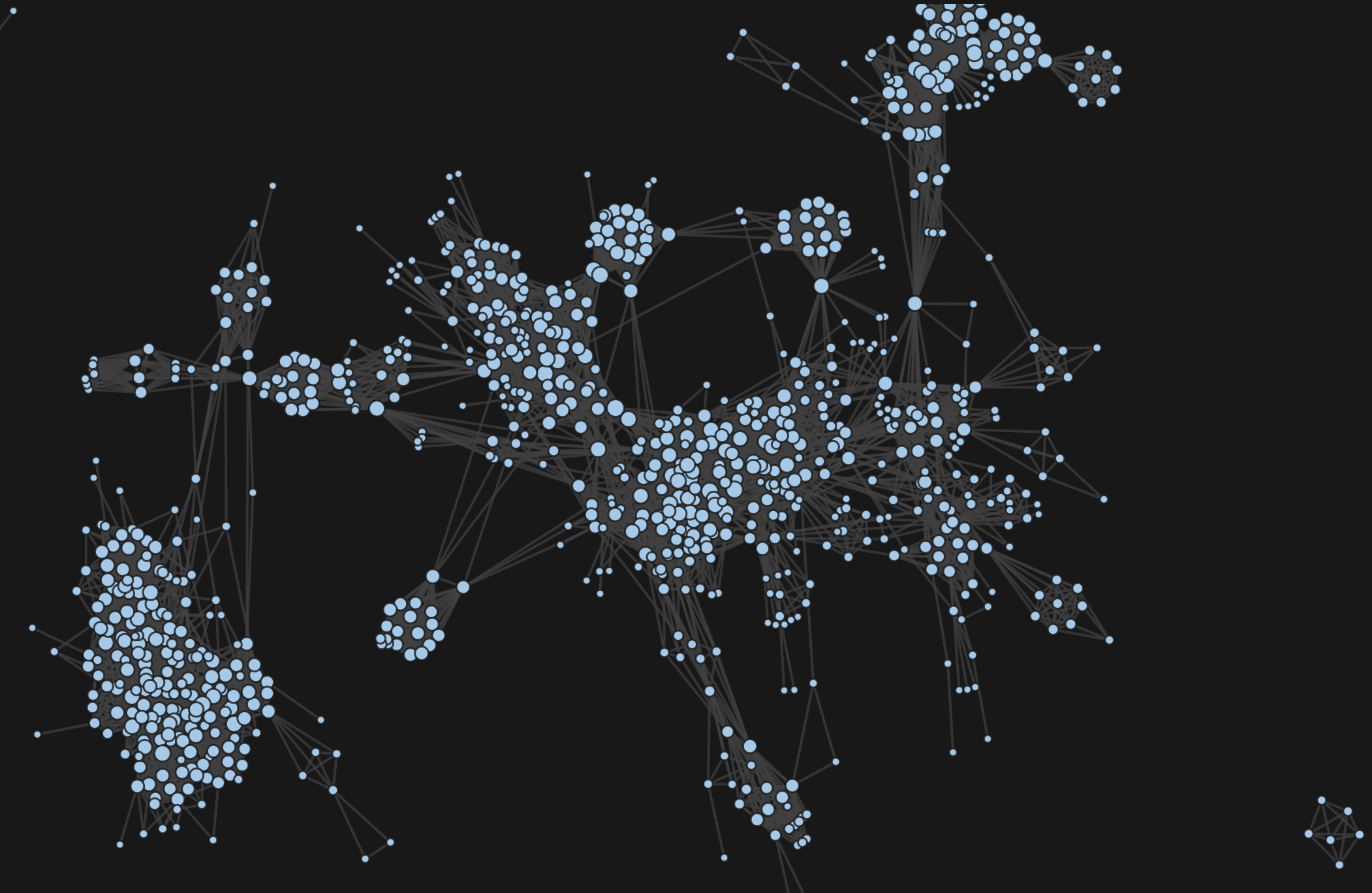
Network Diagrams
Using the techniques above, I am able to compile datasets that provide insights into the similarity of datasets through their metadata. These can then contribute significantly in the exploration and discovery of available datasets, helping to uncover more data on particular topics and bring to light interesting connections that may never have been observed otherwise. While this could be done by simply creating a search function to query the datasets, the integration of network diagrams introduces additional functionality allowing a user to interact with the datasets in new ways.
The network diagrams were created using D3 in JavaScript as it offers much more customizability than python which I used for the data collection and preparation. It also works with web standards and therefore can be integrated within a website easily.
What is a network diagram?
A network diagram is a visual depiction illustrating the connections and relationships among nodes, representing elements, through lines called edges. It provides a concise representation of complex systems, aiding in understanding interactions and dependencies within networks, whether in fields like computer networking, project management, or data analysis.
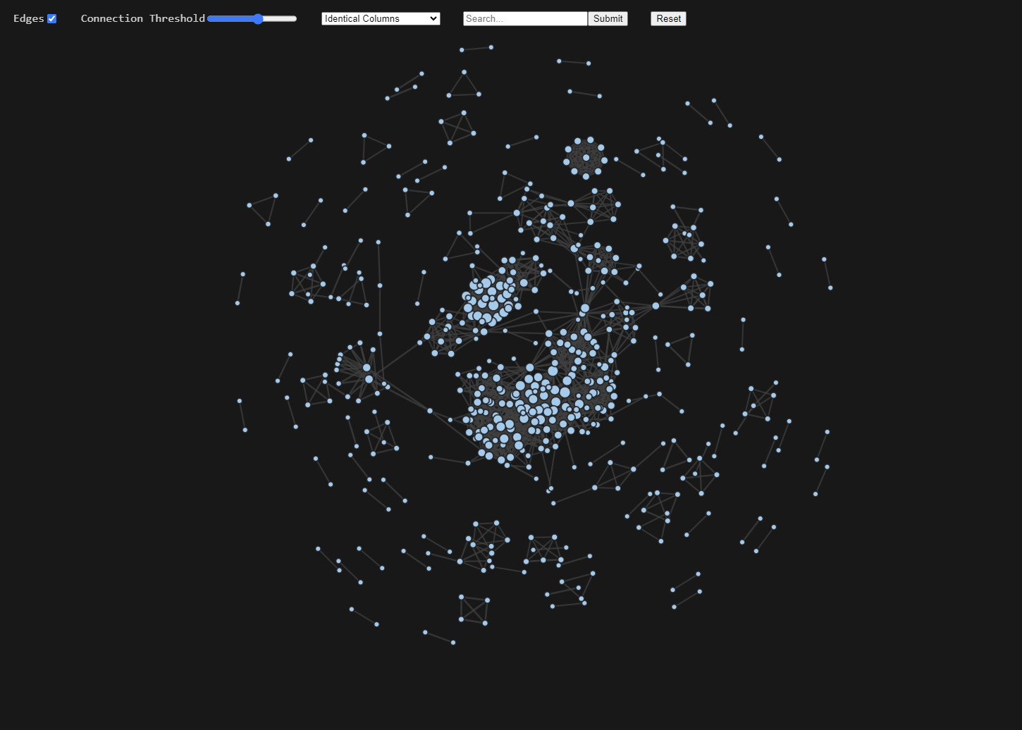
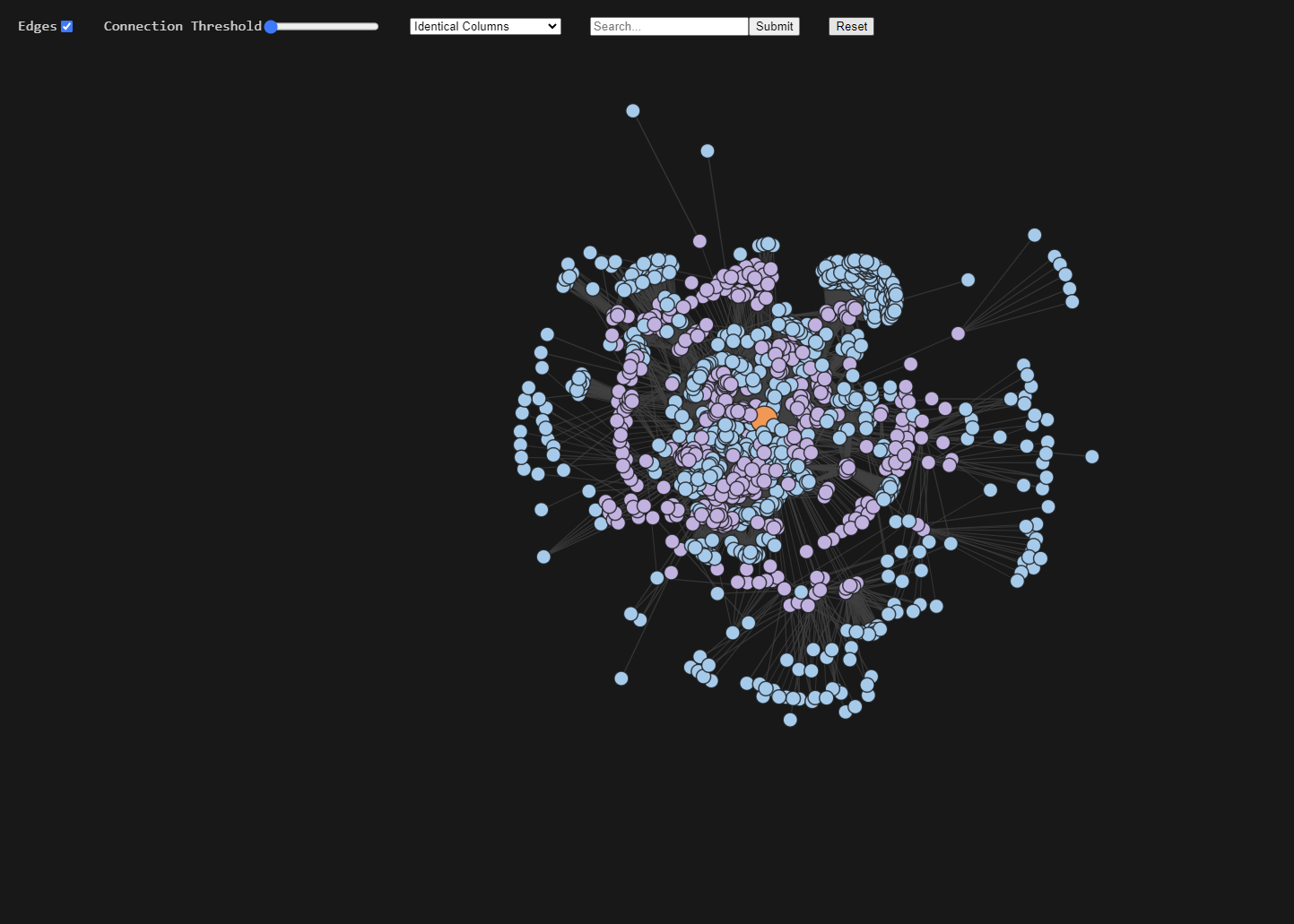
Figure 3 and 4 show screenshots of the network diagram webpage, which includes four settings to aid with interaction:
- Edges: Toggles the edges on and off.
- Connection Threshold: A slider which determines the minimum strength a connection between two datasets must be to appear in the diagram.
- Dropdown Menu: This provides the option to change how the connections are made. For example, figure 3 shows connections based on identical columns but this could be changed to use the description embeddings instead.
- Searchbar: Searches the current datasets being shown for any that have titles which contain the string entered and highlight them yellow. If there are no matches it will use fuzzy string matching and highlight the five most similar.
Other Functions
As well as the settings there are other useful features built in. The area of the nodes is proportional to the number of connections it has and when the mouse pointer is hovered over a node, it will show the name of the dataset. Furthermore, if a node is clicked, a new network diagram is produced showing connections up to two degrees of separation from the clicked node (orange in Fig. 4). Meaning all datasets directly linked to the node (first degree)(purple in Fig. 4) plus all datasets directly connected to those (second degree)(blue in Fig. 4).
The complete code for everything mentioned in this article can be downloaded from the Autonomy Data Unit github under database compendium.